

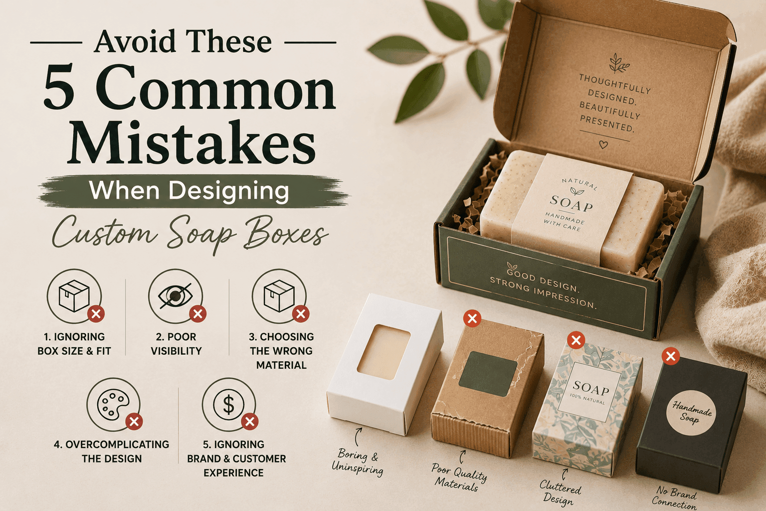
Designing your soap packaging feels like one of the most exciting parts of building a soap brand. You get to choose the colours, the fonts, the finish, the box style. You get to make something that represents your product and your brand on shelves, in gift bags, and in the hands of your customers.
But it is also one of the easiest parts of the process to get wrong. And the mistakes that soap brands make most often are not the obvious ones. They are not picking an ugly colour or forgetting to put the product name on the box. They are subtler decisions that look fine on screen but create real problems once the boxes are in production, on the shelf, or in a customer’s hands.
This guide covers the five mistakes that come up most often when US soap brands design their custom boxes, why each one is more costly than it might seem, and exactly how to avoid them. Getting these right from the start saves you from expensive reprints, delays, and the kind of customer experience problems that are hard to recover from. If you are ready to design soap packaging that avoids all of these pitfalls, The Pioneer Packaging offers custom luxury soap boxes with expert design support, low minimums starting at 50 to 100 units, and free USA shipping on every order.
Why Custom Soap Box Design Mistakes Are More Costly Than They Seem
Before getting into the five specific mistakes, it is worth understanding why these errors matter more for soap packaging than for many other product categories.
Soap packaging in the US market is competitive in a way that is easy to underestimate. Walk into any Whole Foods, Target, or independent boutique and you will find dozens of soap brands competing for attention on the same shelf. Many of them are small to medium-sized artisan and natural soap brands, all targeting similar customers with similar product benefits. In this environment, packaging is often the deciding factor between a customer picking up your bar and picking up the one next to it.
Soap is also a repeat purchase product. A customer who loves your soap and loves the experience of the packaging will reorder. A customer whose first impression is underwhelming, even if the soap itself is excellent, has one less reason to come back.
And practically, packaging mistakes are expensive to fix. Reprinting 1,000 soap boxes because of a design error costs time and money. A mismatch between box size and soap dimensions that was not caught before production means every box in that run is either unusable or requires costly manual adjustment. Getting the design right the first time is always significantly cheaper than correcting it after production.
Mistake 1: Getting the Box Size Wrong
This is the most common mistake soap brands make, and it is also the one with the most immediate and visible consequences. Choosing a box size that does not precisely match your soap bar dimensions creates problems that show up every single time a customer opens a package.
A box that is too large is the most common version of this mistake. When there is too much space between the soap and the box walls, the soap moves around inside the box. During shipping, this movement causes the corners of the soap bar to chip, the surface to scuff, and the edges to lose their definition. A premium soap bar that was perfect when it left your facility arrives looking like it has already been handled.
There is also a presentation problem with an oversized box. When a customer opens a box and sees a soap bar sitting in a too-large space with crumpled tissue paper stuffed around it to fill the gap, the first impression is careless rather than considered. The packaging signals that the soap was an afterthought rather than the centrepiece.
A box that is too small is less common but creates different problems. A soap that has to be forced into its box, or that makes the box bulge at the sides, is a sign that the dimensions were not properly calculated. This can cause the box to fail to close cleanly, which looks unprofessional at retail and creates a practical problem for customers trying to store or reuse the box.
The correct approach is to measure your soap precisely after the curing process is complete, because soap shrinks slightly during curing. Add 3 to 6mm of clearance on each dimension for a snug retail display fit, or 6 to 12mm if you are including any inner wrapping material. These measurements become your target internal box dimensions.
It also matters which dimension you specify. Always specify the internal dimensions of the box, because that is the space your soap occupies. External dimensions include the thickness of the box walls and will always be larger than the internal space by the material thickness on each side.
For US soap brands shipping direct to consumer, the right-sized box also has a meaningful effect on shipping costs. USPS Priority Mail Cubic pricing, which is one of the most cost-effective shipping options for dense products like soap, charges based on box volume rather than weight. The smallest box that safely fits your soap produces the lowest cubic tier and therefore the lowest shipping rate.
Mistake 2: Overloading the Box Design with Too Much Information
This mistake happens because soap brands have a lot they want to say. You have a beautiful natural ingredient story. You have sustainability credentials. You have scent notes, skin benefits, certifications, and social media handles. You have a brand story that took years to build. And you have a box surface that feels like the right place to put all of it.
The result is a box that is cluttered, difficult to read, and visually exhausting. A customer standing at a retail shelf has approximately three to five seconds to decide whether to pick up your box. A box covered in dense text in multiple font sizes, with multiple competing visual elements, does not invite them to engage. It overwhelms them and they move on.
The principle that works consistently in US soap packaging design is hierarchy. Every element on the box should have a clear priority level, and the design should direct the customer’s eye through those levels in order. The brand name or logo is the most important element. The product name or scent is second. A one-line description of the key benefit is third. Everything else, the ingredient list, the weight, the certifications, the barcode, belongs on the side panels where it is available for customers who want it but does not compete with the primary brand communication on the front panel.
White space is not wasted space. A front panel with a strong logo, a clear product name, a beautiful background design or image, and nothing else creates more impact than the same panel filled edge to edge with text and graphics. The restraint is itself a design statement. It communicates confidence. A brand that does not feel the need to justify itself with paragraphs of claims on the front of the box reads as more premium than one that fills every centimetre.
A practical way to audit your current design is to photograph the box front panel and then step back three feet from your screen. What can you still read clearly? What does your eye go to first? If the answer is not your brand name and product, the hierarchy needs work.
Mistake 3: Ignoring FDA Labelling Requirements for Soap Sold in the US
This is the mistake that creates the most serious legal and commercial consequences, and it is the one that many small soap brands in the US discover too late, after boxes have already been printed.
In the United States, how your soap is classified by the FDA determines what labelling information is legally required on the packaging. The classification depends on what claims you make about the product.
A product that is labelled and marketed as a cleanser, meaning it is sold purely on its ability to clean, is regulated as a soap under FDA guidelines and is subject to relatively minimal labelling requirements. It does not need to list individual ingredients, though a net weight declaration, a business name and address, and an identity statement are required.
However, if your soap is marketed with any claims that relate to how it affects the body beyond simple cleaning, such as “moisturising,” “antibacterial,” “exfoliating,” “anti-aging,” “soothing,” or any other benefit claim, the FDA may classify the product as a cosmetic or even a drug. Cosmetics have much more specific labelling requirements under the Fair Packaging and Labelling Act, including a full ingredient list in descending order of predominance using INCI (International Nomenclature of Cosmetic Ingredients) names, net weight in both metric and US customary units, and a manufacturer or distributor name and address.
Most handmade and natural soap brands in the US make at least some benefit claims, which means most should be labelling their products as cosmetics under FDA guidelines. Failing to include the required information does not just create a legal risk. It also creates a practical problem when you try to get your products into retail stores. Most US retailers, from independent boutiques to large chains, will require FDA-compliant cosmetic labelling before accepting a new supplier. If your boxes are printed without the correct information, you have to reprint before you can sell through retail.
The practical steps for US soap brands are to research whether your marketing claims put your product in the soap, cosmetic, or drug category, to have your ingredient list verified by someone familiar with INCI naming conventions, and to confirm that your net weight declaration appears on the principal display panel in the correct format. Including these requirements in your packaging brief before design begins is far less expensive than discovering the problem after boxes are printed.
Mistake 4: Choosing the Wrong Finish for Your Brand Positioning
The surface finish of your soap box does more to communicate your brand’s market positioning than almost any other design decision, and it is the decision that most soap brands make without enough deliberate thought.
In the US soap market, different finishes carry different associations that consumers respond to at a largely unconscious level.
Gloss lamination is the most widely used finish and creates bright, vibrant colours with a reflective surface. It is practical, scuff-resistant, and cost-effective. But in the US market, gloss lamination has become the default finish for mass-market and budget soap products. A gloss finish on a soap brand positioning itself as premium, natural, or artisan sends a mixed signal. The product says one thing; the finish says another.
Matte lamination creates a flat, non-reflective surface that photographs beautifully, feels more sophisticated than gloss, and is strongly associated with premium and luxury positioning in the US beauty and personal care market. For natural soap brands, organic soap brands, and any brand positioning above the mass-market tier, matte lamination is almost always the right default choice. It is slightly more expensive than gloss but the difference in perceived quality is significant and justifies the cost.
Soft touch lamination creates a velvety, tactile surface that is unlike any other finish in soap packaging. When a customer picks up a soft touch soap box, the physical sensation of the surface communicates premium quality immediately and viscerally. For soap brands targeting customers who are willing to pay $15 or more per bar, soft touch lamination is one of the highest-return finishing investments available.
Kraft board without lamination is the right choice for brands whose entire identity is built around natural, sustainable, and minimal packaging. The uncoated natural surface of kraft board, printed with a simple design, communicates authenticity in a way that coated alternatives cannot. For artisan soap brands, farmers market sellers, and natural soap brands targeting eco-conscious consumers, kraft is often a stronger brand choice than any coated finish.
The mistake is choosing a finish because it is the cheapest option or because it is what the supplier uses by default, rather than choosing it because it is right for the brand. If your supplier quotes you on a standard gloss finish and your brand is positioned as premium, the right response is to ask about matte, soft touch, or other alternatives, even if they cost slightly more per unit.
For US soap brands looking to explore the full range of finish options available for their custom soap packaging, The Pioneer Packaging’s custom cosmetic boxes for skincare brands page covers every available finish option with guidance on which finishing treatments work best for different brand positions and price points.
Mistake 5: Skipping the Physical Sample Before Full Production
This is the mistake that the brands who have been through an expensive packaging mistake once never make again, and the one that brands ordering their first run of custom boxes most commonly skip to save time and money.
A physical sample of your custom soap box, also called a pre-production proof, mock-up, or prototype, is a real, physical version of your box produced before the full production run. It lets you check every element of the design in the real world, not just on a screen.
The reason a physical sample is essential is that digital proofs, even high-quality 3D renders, do not accurately represent how a physical box looks, feels, and functions in real life. Colours look different in print than on screen because monitors display in RGB colour while printing uses CMYK. A colour that looks rich and saturated on your monitor may print flat or slightly off-tone. A finish that looks sophisticated in a render may look different under store lighting or in natural light.
More practically, a physical sample lets you test the structural performance of the box. Does the tuck flap close cleanly and stay closed? Is the board weight heavy enough that the box does not feel flimsy when held? Does the box close flat without the corners popping up? Is the glue line strong enough that the seam does not open when the box is squeezed? None of these questions can be answered by looking at a screen.
For soap specifically, the sample lets you test the fit with your actual soap. Put your soap in the sample box. Does it sit snugly? Does it move when you shake the box? Does the lid close cleanly with the soap inside? Is the clearance right so the soap slides out easily without the customer having to force it? These are the kinds of functional tests that take five minutes with a physical sample and are impossible to do digitally.
For US soap brands working with a packaging supplier for the first time, asking for a physical sample before approving the full production run is not just reasonable; it is standard practice. Any reputable supplier will offer physical samples as part of the ordering process. At The Pioneer Packaging, physical samples are available before production is confirmed, so US soap brands can verify colour, finish, structure, and soap fit before committing to a full run.
The cost of a physical sample is typically small relative to the cost of a full production run and completely negligible relative to the cost of discovering a problem only after 500 or 1,000 boxes have been produced. Make it a non-negotiable step in your process.
Bonus: One More Mistake Worth Knowing About
These five mistakes cover the most common and most costly issues for US soap brands designing custom boxes. But one additional issue comes up frequently enough to mention.
That is inconsistency across product lines. Many soap brands design each product’s packaging individually, choosing different colours, fonts, and finishes for each scent or variant as they launch. The result is a product range that looks like it comes from several different brands rather than a single coherent collection.
Consistency across a soap line is one of the most powerful brand tools available, and it requires almost no additional cost to implement. Once you have established a brand identity with specific colours, fonts, a box style, and a finish, applying those same elements consistently across every product in the range creates a visual coherence that makes the brand look more established, more premium, and more trustworthy. When all of your soaps sit together on a shelf or in a display, a consistent design system makes them look like a curated collection. Inconsistent design makes them look like a random assortment.
When briefing a packaging supplier, always supply your brand guidelines, including your exact Pantone or CMYK colour specifications, your font names, and your logo files, so that every box in your range is produced to the same specifications regardless of when it is ordered.
FAQs
What is the most common mistake when designing custom soap boxes?
Getting the box size wrong is the most common mistake. A box that is too large allows the soap to move during shipping, causing surface damage and creating a poor unboxing impression. Always measure your soap after curing and add 3 to 6mm of clearance on each dimension to get the correct internal box size.
Do I need FDA-compliant labelling on my soap boxes in the US?
It depends on how your product is marketed. Soap sold purely on its cleaning ability has minimal labelling requirements. If you make any benefit claims such as moisturising, exfoliating, or antibacterial, the FDA is likely to classify your product as a cosmetic, which requires a full ingredient list in INCI format, net weight in both metric and US customary units, and manufacturer or distributor name and address.
What is the best finish for custom soap boxes in the US market?
It depends on your brand positioning. Matte lamination is the most popular finish for premium and natural soap brands because it creates a sophisticated, non-reflective surface that photographs well and communicates quality. Soft touch lamination is the strongest premium finish for brands targeting the high-end market. Kraft board without lamination is right for brands built around a natural and sustainable identity.
Should I always get a physical sample before full production?
Yes, always. A physical sample lets you verify the colour accuracy in print, test the structural performance of the box, check the fit with your actual soap, and confirm that the finish matches your expectations. This step prevents the most expensive kind of packaging mistake, discovering a problem only after a full production run has been completed.
How much information should I put on the front panel of a soap box?
As little as necessary to communicate your brand and product clearly. The front panel should have a clear visual hierarchy with your brand name or logo as the primary element, the product name as secondary, and a brief benefit statement as tertiary. Ingredient lists, certifications, and additional claims belong on the side panels where interested customers will find them without cluttering the primary brand surface.
What happens if my box design is inconsistent across my soap range?
Inconsistency across a product range makes the brand look less established and less professional. When different products have different colours, fonts, or finishes without a coherent design system connecting them, the range looks random rather than curated. Establishing brand guidelines, including specific Pantone or CMYK colour codes and font specifications, and applying them consistently across every product in the range creates a cohesive collection that reads as more premium.
Can I change my soap box design after production has started?
No. Once production begins, the design is locked. This is why getting the design right before approving production is so important. Changes after production require a full reprint, which means paying for a new production run and potentially disposing of the already-produced boxes.
Getting Your Soap Box Design Right from the Start
Avoiding these five mistakes does not require a large budget or a team of professional designers. It requires being deliberate about each decision rather than treating packaging as an afterthought that gets sorted out at the end of the product development process.
Measure your soap correctly, specify the right internal box dimensions, keep your design clean and hierarchically clear, check your FDA labelling requirements before design begins, choose a finish that matches your brand positioning rather than defaulting to the cheapest option, and always get a physical sample before approving full production.
Each of these steps is straightforward when you know about it in advance. Each one is costly to fix when you discover it has been skipped.
For US soap brands ready to design their packaging with all of these principles built in from the start, explore the full range of custom cosmetic and soap packaging boxes at The Pioneer Packaging. With custom sizing in any dimension, a full range of finishes from matte and soft touch to foil stamping and spot UV, physical samples before production, low minimums starting at 50 to 100 units, and free shipping across the USA, The Pioneer Packaging gives soap brands every tool they need to get their packaging right the first time.